Head of Brand at RMB, Lucy Lightfoot says HKLM was selected as a result of their insightful strategic approach, their unique take on design as well as their exemplary track record when it comes to working with major blue-chip financial brands across the continent, including RMB’s brand refresh 14 years ago.
Over the past year, HKLM has assisted RMB to ensure the brand refresh reflects its overarching purpose, which is to liberate diverse talent to do good for business for a better world. RMB has long had a strong focus on talent, ethics, innovation and entrepreneurial spirit and it was important that these factors manifest well in the various building blocks that make up the brand. The project has included updating RMB’s brand positioning and corporate identity, which was last updated by HKLM in 2006.
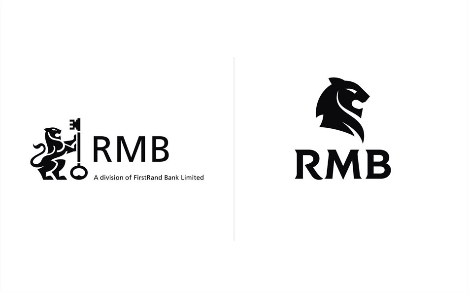
During the previous refresh in 2006 HKLM simplified the RMB logo, which had included two lions, two keys and two circles to a less complex and modernised logo consisting of a single lion and key. Although this logo has served the business well, in today’s digital world it needed to be simplified even further in order to ensure that it can live confidently across multiple platforms.
The new logo represents an evolution rather than a revolution given that it retains a sense of familiarity and builds on the strength of RMB’s existing brand equity. Distilled into a simplified icon of a lion’s head, the new logo conveys both modernity and stature, embodying RMB’s African heritage, strength and the pride it takes in doing good business.
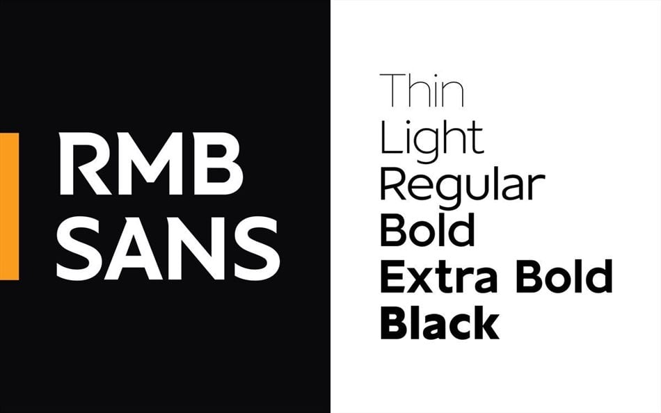
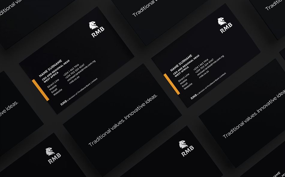
A new RMB logotype has been created to complement the new logo. At the same time an entirely new and unique RMB corporate font called RMB Sans has been created for use in all RMB communication. The colour palette has been reduced to a bold black and white with a touch of amber to add an aspect of vibrancy and to draw attention to important aspects of the communication. “The RMB brand can now step boldly into the future with an identity fit for the digital age,” says creative director at HKLM Catherine Kruger.
HKLM rolled out an internal brand engagement exercise across all levels of RMB, including its various executive committees, an identified team of brand ambassadors, and the broader workforce as the strategic and design components of the rebrand process drew to a close.
Head of HKLM Brand Consulting, Zahra Mirza, says it was critical that RMB’s new brand positioning was communicated effectively and brought to life across its various internal stakeholders, as building the brand from the inside-out would prove most effective. “The brand engagement exercise served to create momentum and understanding internally in order to embed the brand within the business. This brand engagement will then be expanded to clients, external partners and the broader business community.”
This process usually requires a series of face-to-face workshops, however, due to lockdown realities, HKLM ran this process virtually for the first time, successfully delivering all sessions through a video conferencing interface. “Although the prospect of implementing the process virtually was extremely daunting at first, thanks to our sound relationship with RMB, the commitment and can-do attitude of our team and the RMB brand ambassadors, we delivered an innovative programme that received great feedback from its participants,” adds Mirza.